


Are you a minimalist or a maximalist?
Posted on 15th February 2022
Now there’s a question you don’t hear every day. How often are you just sitting around minding your own business when some blog writer comes up to you and asks; “Are you a minimalist or are you a maximalist?”
You wouldn’t be blamed if you stood there blinking at them bewildered. However, if you’re trying to design food packaging for your Italian food outlet, then it is a good question. Honest.
Well, if you hadn’t really given it much thought, then perhaps now is the time to. Let’s find out which branding style suits your takeaway food business best.
Let’s talk about being a minimalist
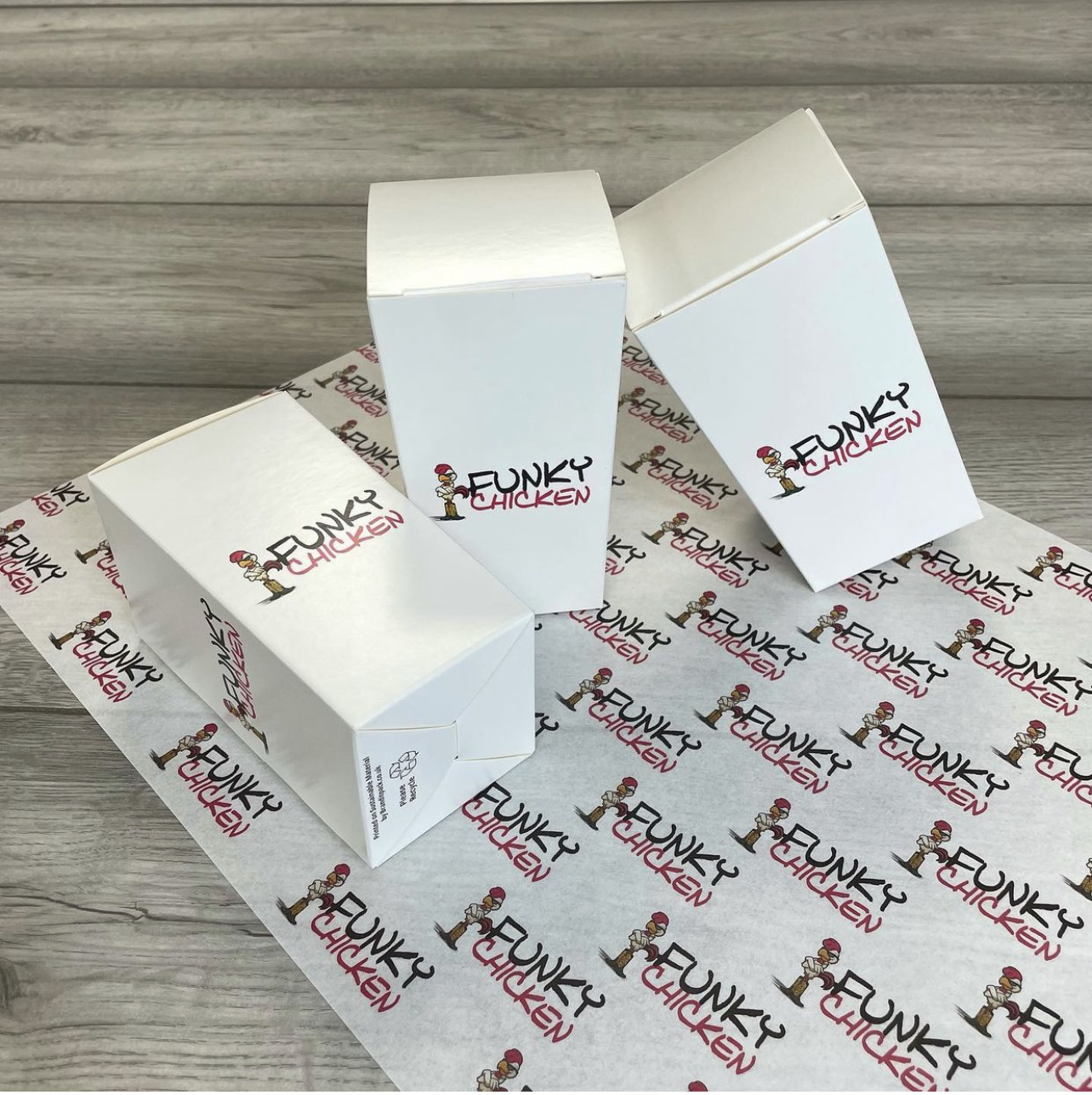
“Less is more”. That isn’t an uncommon saying. In fact, the ‘less is more’ ethos has been a dominant style over the past few years. Where minimalism might sound like it’s a boring empty space; actually, it has been very popular. Look at Chic Scandinavian interior design, or expensive perfumes that allow for a lot of negative space.
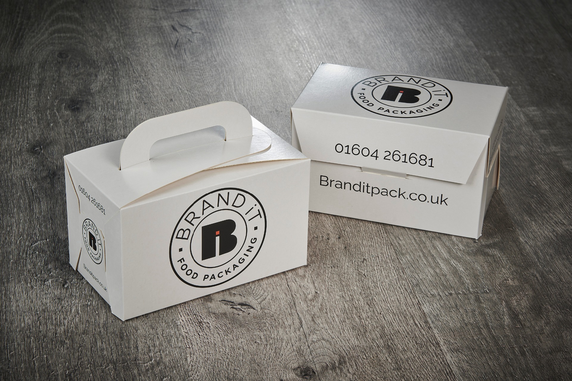
In packaging minimalism is about cleanliness, uncluttered designs, and symmetry. It allows the mind to soak in everything all at once and gives the eye a rest. In short, minimalism has been synonymous with sophistication and simplicity.
Why is minimalism branding effective?
Minimalism is versatile. If you don’t want to run the risk of having your brand becoming outdated. In short, minimalism is not only about being elegant, but it is also about playing it safe.
It also stops the customer from being distracted. If there is a simple marketing message presented on minimalist packaging, then the eye is drawn to the message and there is no mistaking it.
It is clear and simple and effective.
But what about being a maximalist?
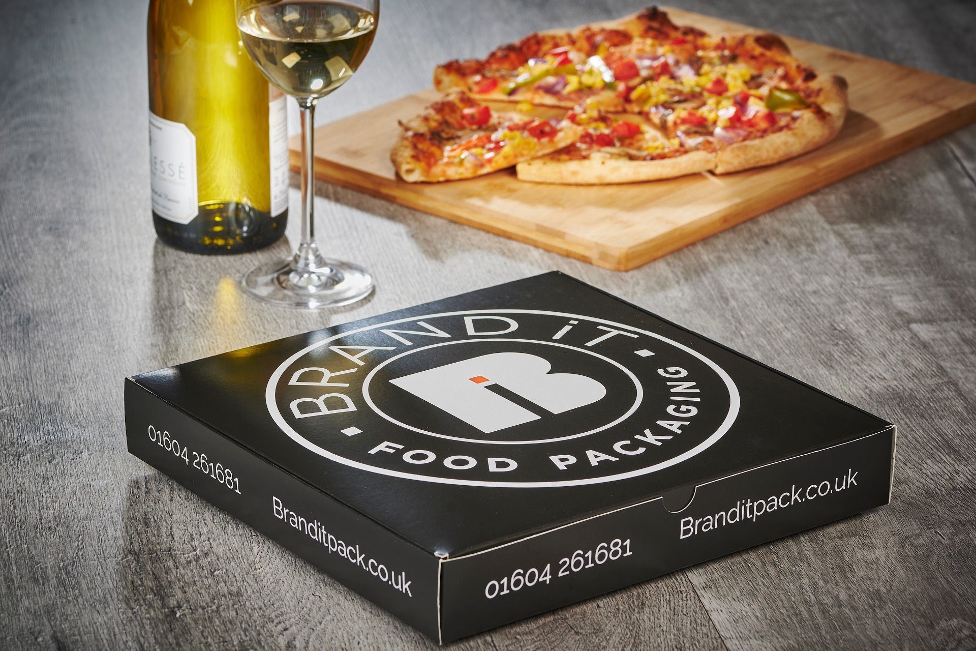
Let’s be honest, if the world was all minimalist, it would look like a very boring place. Maximalist designs are proud, loud, and elaborate. For this reason, they stand out against the never-ending sea of muted colours typified by minimalist designs.
It’s almost like maximalists see the subtlety and elegance all around them and say, “not for me”. Why be understated? Why be subtle when you can dazzle your customer with the power of a thousand unicorns?
Maximalist designs use vibrant colours, flashy typography, and sometimes optical illusions or unusual shapes. It might sound a little gaudy, but then if you think about the bright purple box of Twinings fruit tea collections, you can see that maximalism still can portray elegance.
Why is maximalism effective
Put simply, you can see and hear the branding from a million miles away. It’s bold and in your face and is asking to be noticed. It might lack the simple symmetry and sophistication of your quiet boxes, but then that isn’t what it is going for.
Maximalist packaging works if you need to make your brand stand out in a crowded product category. There might be a lot of pizza outlets in your area. There maybe a few other street vendors near you that are all using those handsome white boxes. This is when you should think ‘more is more’.
So how do you choose between the two?
There is no easy answer to this. It all depends upon your target customers. Obviously, if your product is aimed at children then it goes without saying that your food packaging needs to be exciting, busy, and scream pizzazz. But your target market might not be kids, they might be female millennials who are buying cosmetics that use one or two colours on the package.
To answer this, you need to understand your customer base, perhaps even do a little market research and find out what they like.
Whatever you decide, we can help you design the perfect branded food packaging. Call us on 01604 261 681 and start your branding journey today.
Tagged as: Branded Packaging
Share this post: